


As Google continues to prioritize mobile-friendly sites, having a responsive website for your business is becoming more and more important. When your website is responsive, it will look great on all devices (mobile, tablet, desktop, etc.)
While it may seem daunting to overhaul your existing site, responsive website design doesn’t have to be difficult. Below are some handy tips and best practices that will help you to produce a great, usable website product easily and with little fuss.
Define Your Style
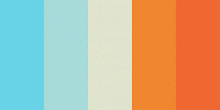
Creating a Colour Palette
Whether you are working with a predefined brand colour palette or creating your own, remember to include enough contrasting colours that you can establish a well-defined visual hierarchy. Adding in various shades of neutral colours will give you lots of flexibility within your designs.
Think mobile first
Think about how your web elements will look on small mobile devices first and then apply to larger viewport sizes. For example, are your buttons large enough for a finger press and spaced far enough away from other clickable elements?
Create your style guide after your initial layouts, not before
Some people like to create a style guide and define their web element styles before they begin a high fidelity prototype or mockup. Once the elements are positioned on the page, however, and are viewed relative to each other, the overall design of the page may be lost. Create a few mockups to start, establish your styles and then comp out your remaining pages if necessary.
Consistent doesn’t have to mean boring
Usability heuristics are important but so is standing out from the billions of other websites on the web. Don’t be afraid to try something different, to be more memorable and to help your website’s brand stand out from the crowd. Your website can be creative and also very usable. A great UI designer or digital art director should be able to balance these two elements.
Some elements you may want to style and standardize include:
- Headline Levels: H1, H2, H3…
- Main or Hero imagery
- Primary Navigation
- Secondary Navigation
- Body copy
- Numbered and bulleted lists
- Call-outs or badges
- Treatment for content images
- Pull-quote style
- Widgets (rotators, social embeds, calendars etc.)
- Large call-to-action buttons
- Secondary buttons or text links
- Form elements
- Footnotes and legal mice type
- Social Share
Type
Copy Blocks
Play with letter-spacing (tracking), margins and line spacing (leading) to help redefine your hierarchy. The tighter the spacing, the heavier and more claustrophobic the text will appear.
Keep in mind that long blocks of text that run all the way from the left side to the right of your desktop screen can be very hard on the eye. Use a narrower copy block when possible. However, too much spacing can create an arid, scattered feeling.
Don’t be afraid to break it up
If you have a webpage that is very content heavy, break up the content a bit with pull-quotes, callouts, images, styled lists, tables, etc. You can also incorporate accordions, drop downs and carousels to keep the page interesting and informative.
Yes, people DO scroll down
Don’t fall into the old-school trap of thinking everything on your webpage must appear above the digital fold. Keep the most important or compelling content near the top of the page to lead a user farther down. This could be a creative yet descriptive headline, a compelling lead-in sentence or a powerful image.

Sizing Up Type
Generally speaking, stick to a font size of 14 -18 pixels for a responsive website. In general, use simple sans or serif fonts for those larger blocks of copy and keep it on a light background with a moderately contrasting typeface colour. The main headline can be larger but keep in mind it may need to be styled slightly smaller after a mobile sized breakpoint is encountered.
Type Colour
The trick with type colour is that it should have enough contrast from the background that you can see it easily but what many designers don’t know is that sometimes type can have too much contrast and is harsh on the eye, making it appear to vibrate when viewed. Try to use lighter type on a darker background sparingly and only for smaller text blocks.
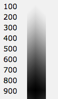
Type Weight
Heavier weight font styles can be difficult to read in smaller sizes and may make the page feel dark and heavy at larger sizes. Thin and light font styles look great on retina and retina type screens but can look faint on many standard resolution screens.
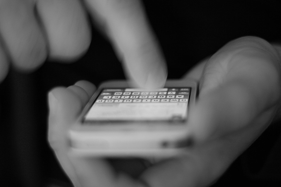
Navigation
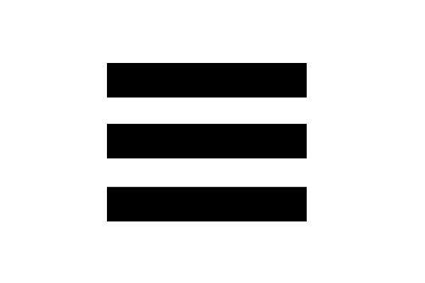
Hamburgers!
The Navicon is the icon that also looks like a little sandwich or hamburger with three stacking lines. If you feel your general user demographic are not all that savvy with online technologies—always include the word “menu” above or beside the Navicon. User studies to date show that a user is more apt to browse your site if you include the word Menu or Navigate beside or above the Navicon.
Include a ‘Back to Top’ button at the bottom of long scrolling page
Research tells us that many mobile device users do not know how to easily jump to the top of a webpage within their mobile web browser. To solve this, provide a ‘back to top’ button at the bottom of your webpage. This will allow a user easy access to the site navigation if it is not mirrored in the footer.
Another option is to create a sticky nav. This is a top site navigation bar that always sticks to the top of your screen no matter how far down the page you scroll. If you choose to go this route, be sure to make your sticky nav no more than 100px high or you might run out of room for your page content on smaller viewport sizes.
Design Glossary:
Callout
a short piece of text set in stronger treatment than the rest of the page and intended to attract attention.
Copy Block
a grouped paragraph or series of paragraphs of text.
The (digital) fold
used in website design (along with “above the scroll”) to refer to the portion of the webpage that is visible without scrolling. As screen sizes vary drastically there is no set definition for the number of pixels that define the fold.
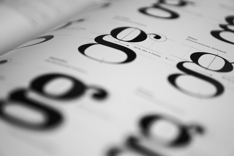
Serif
a slight projection finishing off a stroke of a letter in certain typefaces.
Sans Serif
a sans–serif, sans serif, gothic, san serif or simply sans typeface is one that does not have the small projecting features called “serifs” at the end of strokes. The term comes from the French word sans, meaning “without” and “serif” from the Dutch word schreef meaning “line”.
Type (Typographic) Weight
relative darkness of the characters of a type font resulting from the relative thickness of the strokes, expressed as light, bold, extra bold, etc.
User
a person who uses or operates something, especially a computer, device or other machines.
Viewport
a framed area on a display screen for viewing information.
White Space
in page layout, illustration and sculpture, white space is often referred to as negative space. It is the portion of a page left unmarked: margins, gutters, and space between columns, lines of type, graphics, figures, or objects drawn or depicted.


